about this project
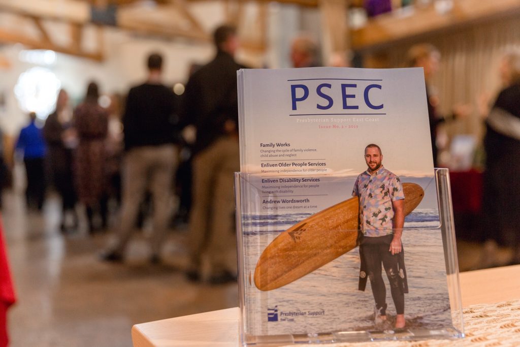
Presbyterian Support East Coast (PSEC) published an annual magazine but in 2018 the team came to me wanting a new, sophisticated look. The brief was to keep things clean, professional, easy to read but with creative flare.
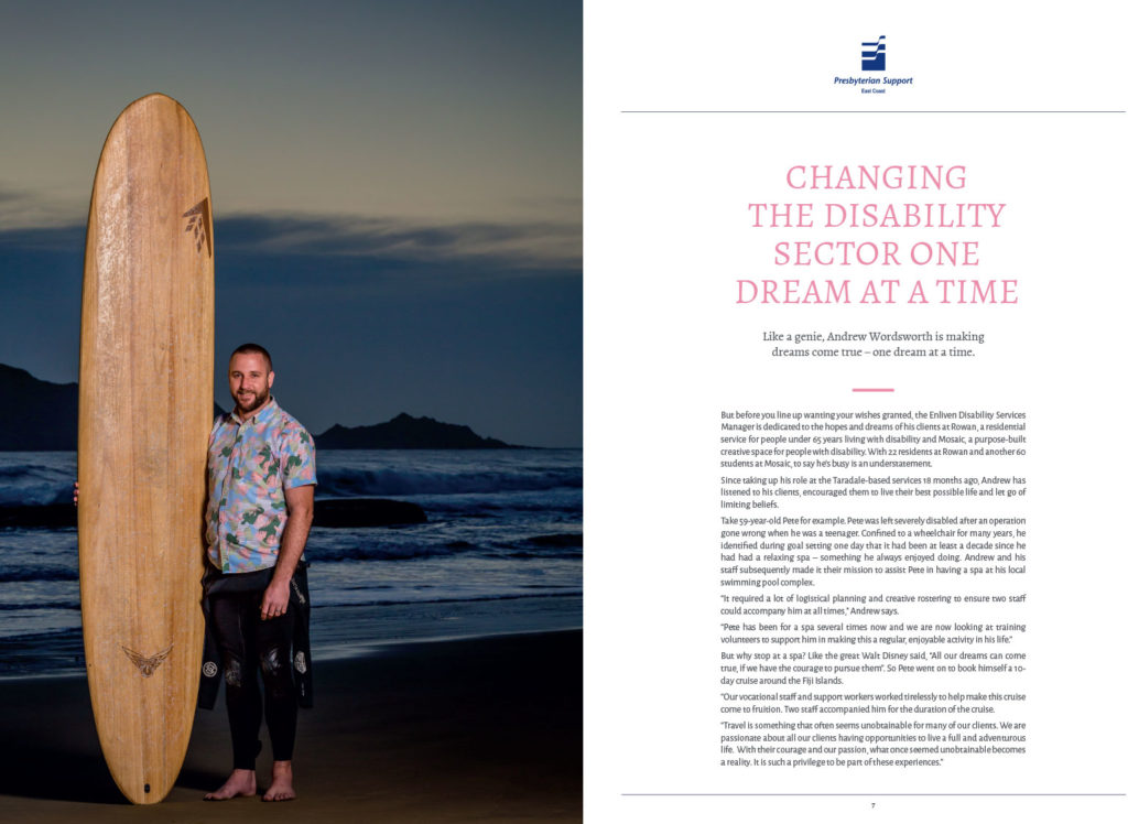
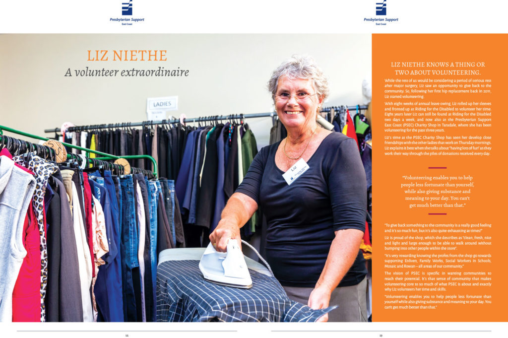
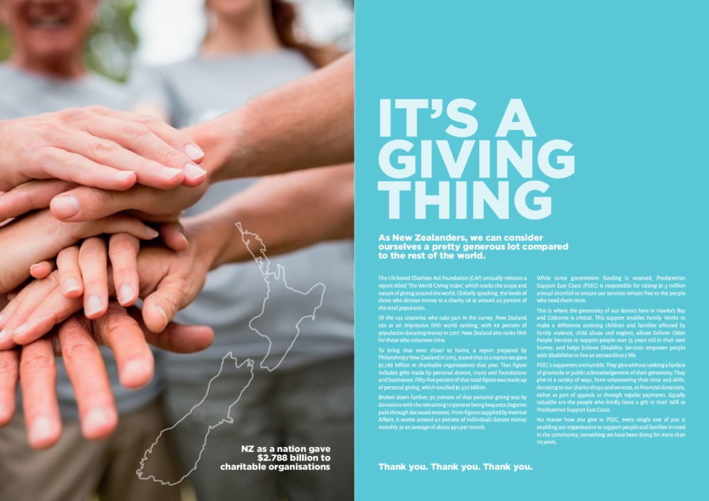
I had great brand guidelines and a creative colour palette to work with. Clean, fresh, white space, large dominating imagery and blocks of colour were the features of this magazine. The content was upbeat and engaging and the imagery and design matched.
The print quality was exceptional, including a 5mm spine with a beautiful soft matte thicker cover. I’ve had the pleasure of designing this magazine for two consecutive years now.